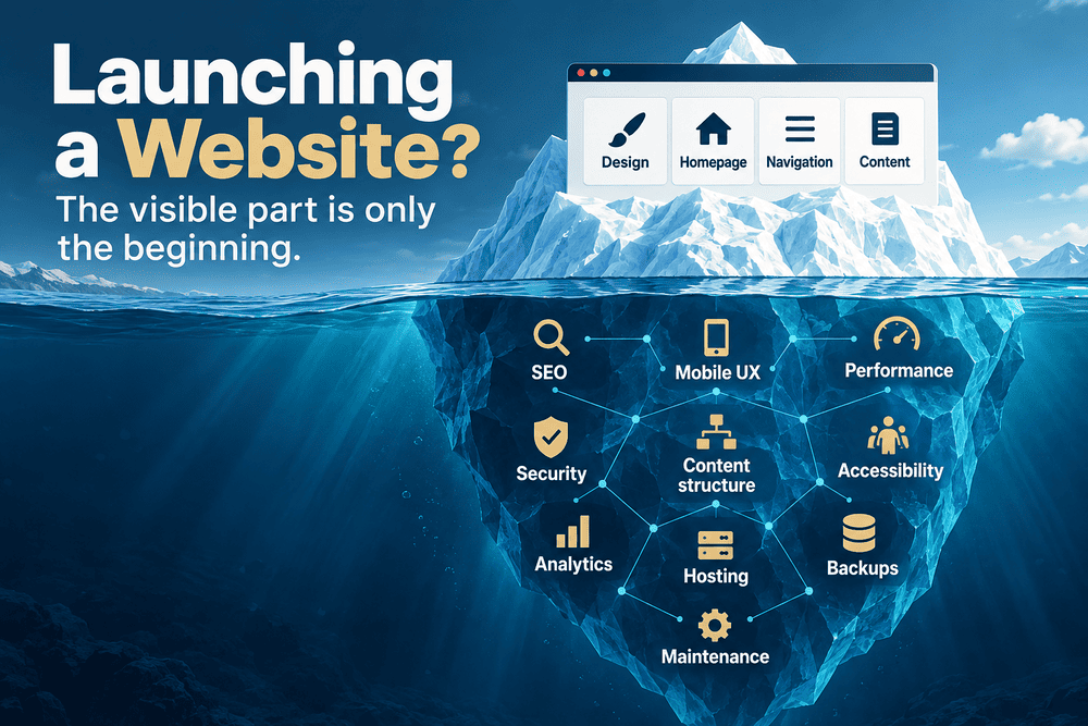
A website can look finished long before it actually is.
The homepage is designed. The navigation works. The contact form sends messages. The logo is in the header, the domain is connected and everything looks respectable on a laptop.
Then the website goes live.
That is often the point when the less visible problems start appearing.
A page that made perfect sense while building the site turns out to be difficult to find. A section that seemed important attracts little attention. A new article needs to be published, but the content system was never designed for it. Google discovers URLs you did not expect it to discover. The mobile version exposes spacing and navigation problems that were barely noticeable on desktop.
I have run into versions of these problems while building and changing Cordinant. Some were technical. Others came from decisions that seemed perfectly reasonable earlier.
It changed the way I think about launching websites.
A launch is not really the moment when a website becomes finished. It is the moment when assumptions finally meet real use.
Mistake 1: Starting With the Website Instead of Its Job
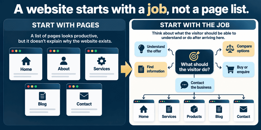
One of the easiest ways to start a website project is to think about pages.
Home. About. Services. Products. Blog. Contact.
It feels productive because you immediately have something concrete to organise.
But pages are containers. They are not the reason the website exists.
A small company may need its website primarily to generate enquiries. Another business needs customers to understand a complicated service before contacting anyone. A software creator may need product pages, documentation, demos and articles. A local business might care much more about calls, directions and opening information than about publishing long-form content.
Those differences eventually affect almost everything: navigation, content, calls to action, CMS requirements and even what should appear above the fold.
A beautiful five-page website may be entirely adequate for one company and strangely limiting for another.
A useful early question is not “Which pages do we need?” but “What should someone be able to understand or do after arriving here?” The page structure usually becomes clearer after that.
This sounds like a small distinction. In practice, it can determine whether the website architecture still makes sense a year later.
Mistake 2: Treating the Homepage Like the Whole Website
The homepage gets an unusual amount of attention during website projects.
It is understandable. It is the obvious place to start, and it is often the page people show when discussing a redesign.
But visitors do not necessarily experience a website from the homepage outward.
Someone may arrive directly on a blog article from Google. Another visitor may open a product page from a social post. Someone else may receive a link to a specific service page from a colleague.
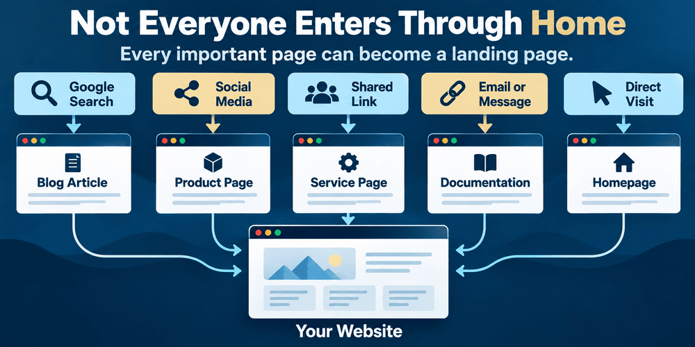
Suddenly the carefully constructed homepage journey does not matter very much.
Each important page needs enough context to work as an entrance.
That does not mean repeating the whole company story everywhere. It means thinking about what a visitor knows when landing directly on that page, what they can discover next and whether the navigation gives them somewhere sensible to go.
I became much more aware of this with Cordinant as the site grew. Product pages, blog posts and documentation are not simply branches hanging below a homepage. They are entry points of their own.
That changes how internal links, navigation and page introductions feel.
Mistake 3: Designing Navigation Around the Business's Internal Logic
Businesses know themselves too well.
Departments, internal terminology, product families and service categories feel obvious when you work with them every day. A new visitor has none of that context.
This can produce navigation that is technically organised but surprisingly difficult to understand.
Imagine a company offering three services. Internally, those services belong to divisions called Solutions, Advisory and Operations. That structure may be completely logical inside the company.
A potential customer might simply be looking for “Website Development.”
If they have to understand the organisation before they can find the service, the navigation is doing the wrong kind of work.
There is a related problem with clever labels. Words such as Explore, Discover or Solutions can look cleaner than descriptive navigation labels, but sometimes they hide more than they reveal.
Clarity is rarely the glamorous part of web design.
It is often the part people notice only when it is missing.
Mistake 4: Designing the Website Before Understanding the Content
A design mock-up can make content look wonderfully tidy.
There is a heading of exactly the right length. Three cards contain descriptions of roughly equal size. A testimonial fits perfectly beside a photograph.
Real content is less cooperative.
One product needs two sentences of explanation. Another needs six. A blog title wraps onto three lines. A category name is longer than expected. The business later wants to add documentation, FAQs, videos or another call to action.
This is where designing around placeholder content can become expensive.
The layout has effectively been designed for an imaginary business.
I prefer to think about the likely content types early, even if the final text does not yet exist. What can be long? What can be optional? Which sections might multiply? What happens when there are 30 blog posts instead of three?
Those questions are not particularly visual, but they influence whether the design survives contact with actual content.
A website can be perfectly designed for the content it has on launch day and badly designed for the content it will have six months later.
Mistake 5: Choosing Technology Before Understanding What the Site Will Become
Technology decisions are sometimes treated as the starting point.
“Should we use WordPress?”
“Should this be custom PHP?”
“Do we need Shopify?”
“Should we build a web application?”
There is nothing wrong with those questions. The problem is asking them too early.
A brochure website, online shop, publishing-heavy website and interactive web application have very different requirements. Even two apparently similar business websites can develop in different directions.
A site that will rarely change may need very little content management. A company planning hundreds of articles, landing pages and categories has a different problem. A business selling physical products needs commerce infrastructure that a software creator selling a few downloadable products may not.
| Likely Requirement | What It May Affect |
|---|---|
| A small, mostly static website | May favour a relatively simple architecture |
| Frequent articles and landing pages | Content management becomes much more important |
| Large product catalogue | Product data, filtering and commerce requirements matter |
| Customer accounts and interactive tools | The project begins behaving more like a web application |
| Documentation and structured resources | Content relationships and navigation need planning |
Cordinant uses a custom PHP/MySQL CMS. That suits the way I want to structure my own products, articles, media and documentation, but I would not take that as evidence that every business needs a custom CMS.
Custom software creates freedom, but it also creates responsibility.
An existing platform can impose limitations, but those limitations may be completely acceptable if it already solves most of the business problem.
The interesting question is less about which technology is “best” and more about what kind of website you are actually building.
Mistake 6: Building for Launch Day and Forgetting Month Twelve
This may be one of the most expensive website launch mistakes because it rarely looks like a mistake at the beginning.
Suppose a business launches with six service pages.
The navigation is clean. The sitemap is simple. Everything fits.
Then the business starts publishing articles. It adds case studies. A new service appears. There are downloadable resources, new categories and perhaps a second product.
The original structure begins to stretch.
This is normal. Nobody can predict every future requirement.
The problem is not failing to predict the future perfectly. It is creating a structure that has no room to change.
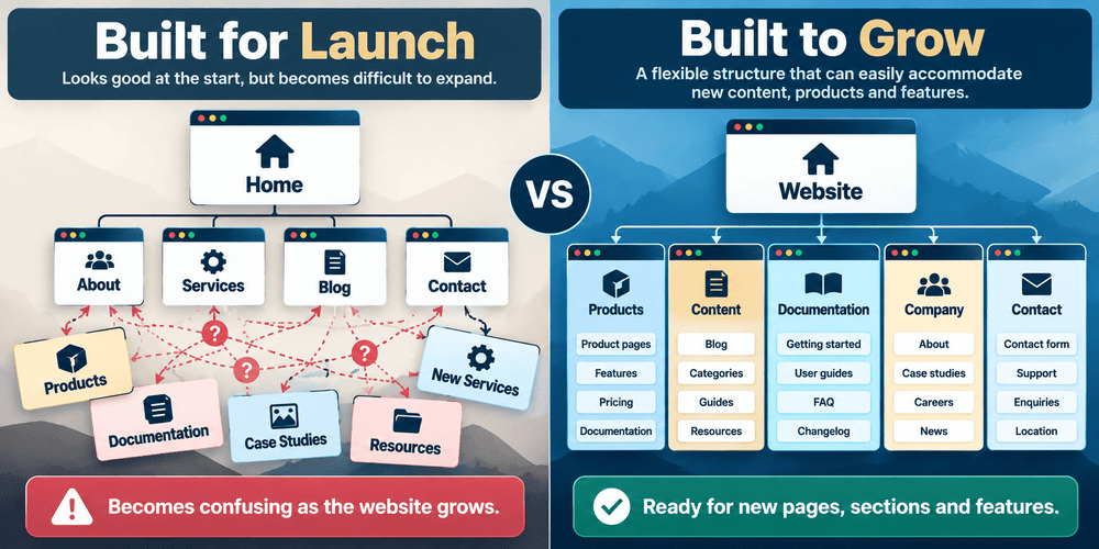
When I added and changed parts of Cordinant, I repeatedly found that one feature affected something else. A new public documentation section is not just a new page. It can affect the database, admin panel, product pages, navigation, sitemap and internal linking.
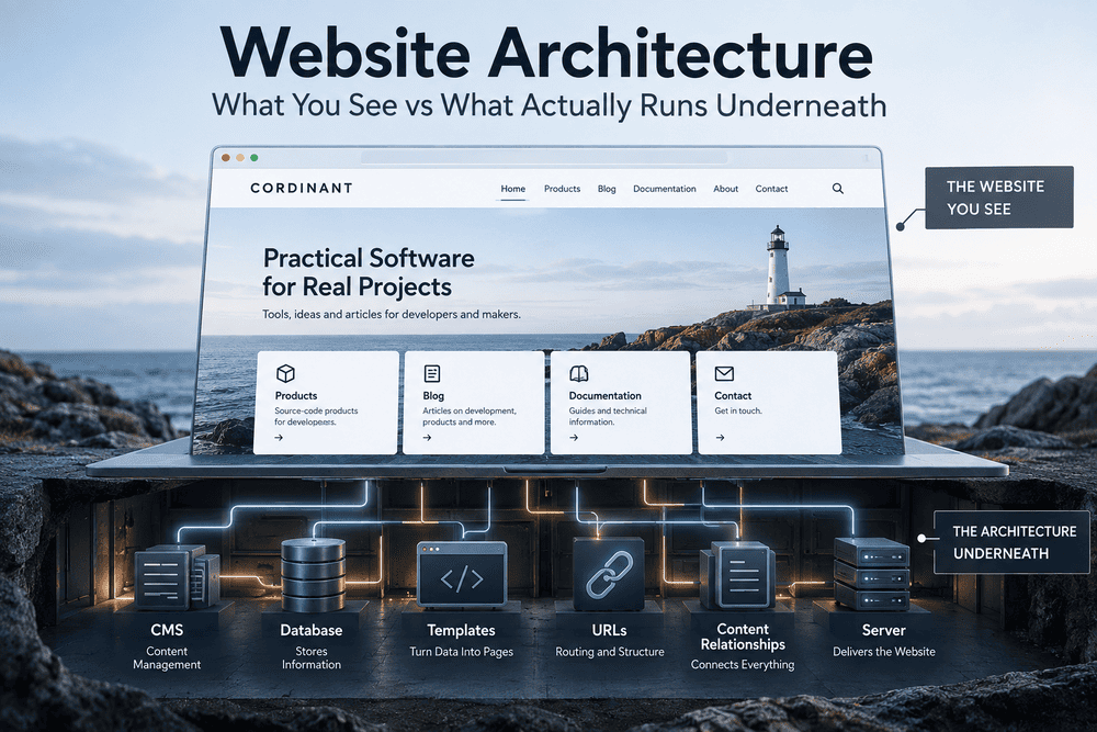
A website is a system, even when it looks like a collection of pages.
That becomes much easier to see once the system starts growing.
Mistake 7: Thinking About SEO After the Website Is Built
SEO is often treated like decoration applied near the end.
The site is finished, so now someone needs to “do the SEO.”
That makes SEO sound like adding titles, descriptions and keywords to completed pages.
Some SEO work does happen at page level, but search visibility is also influenced by decisions made much earlier: site structure, crawlable links, URL design, content organisation, mobile usability and whether search engines can understand and access important pages.
Google's SEO documentation describes SEO partly as helping search engines understand content and helping users find a site through search. It also emphasises logical organisation, descriptive URLs, links between pages and useful, people-first content.
In other words, SEO has an architectural side.
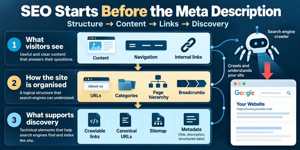
This is something I became more conscious of while working on Cordinant.
Changing a URL is easy.
Changing a URL without breaking old links, creating unnecessary redirects, confusing canonical references or forgetting the sitemap requires more thought.
Similarly, adding a blog category sounds like a content decision until you start asking how the category pages are indexed, how breadcrumbs work and how articles link back into the rest of the site.
SEO cannot guarantee rankings. Google explicitly says there is no guarantee that a particular site will be added to its index, and changes may take from hours to months to be reflected. SEO is better treated as part of making a site understandable and discoverable than as a switch that produces traffic after launch.
Mistake 8: Writing Copy to Fill the Design
There is a particular kind of website text that says many things without communicating much.
“We provide innovative solutions tailored to your unique needs.”
“Our dedicated team delivers high-quality services.”
“We help businesses achieve their goals.”
You can put these sentences on a software website, marketing agency, consultancy or construction company and barely notice the difference.
Sometimes this happens because the content is written after the design. The page contains three boxes, so someone needs three pieces of text to fill them.
The design starts controlling the message.
Useful business copy usually has more concrete work to do. What does the company sell? Who is it for? What is different about the way it works? What happens after someone contacts the business? What exactly is included?
Specific information may sound less impressive than polished marketing language, but it gives visitors something to understand.
This matters particularly with unusual products or services.
For example, describing a product as a “finance solution” leaves enormous room for interpretation. Describing it as a self-hosted PHP/MySQL personal-finance source-code product gives the visitor a much clearer idea of what is actually being offered.
Clarity can filter people out as well as draw them in.
That is not necessarily a failure.
Mistake 9: Publishing a Blog Without Deciding Why It Exists
Adding “Blog” to the navigation is easy.
Maintaining one is different.
A business blog can attract search traffic, answer questions, document work, explore ideas, support product pages or simply give the company a place to publish useful material.
But a blog with no real purpose often becomes an archive of five posts from launch month.
There is another extreme: publishing large quantities of generic articles because someone said businesses need content for SEO.
Neither approach is particularly attractive.
For Cordinant, I gradually moved toward treating the blog less like an educational centre and more like a place where I can write about products, development decisions, self-hosted software, UX, SEO, AI-assisted development and things I find interesting while building.
That affects the subjects I choose and the tone I use.
A plumbing company, restaurant or B2B software business would probably arrive at a very different answer.
The important part is that “having a blog” and “having a content strategy” are not the same thing.
Mistake 10: Making Every Page Lead Somewhere — Except Somewhere Useful
Calls to action can become strangely mechanical.
Every section ends with a button.
Get Started.
Learn More.
Contact Us.
Sometimes three buttons compete with each other on the same screen.
The existence of a CTA does not automatically make the next step clear.
A visitor reading an introductory article may not be ready to buy anything. Someone on a detailed product page may be. A person reading a software documentation may simply need to return to the product.
The appropriate next step depends on context.
This is why internal linking is more interesting than it first appears. Links are not only an SEO mechanism. They shape how people move through the website.
Google also uses links to discover pages and understand relationships between them, which makes sensible internal linking useful for both visitors and crawling.
A website with dozens of isolated pages may technically contain plenty of information while still feeling like a set of dead ends.
Mistake 11: Assuming Desktop Design Will Naturally Become Mobile Design
A desktop layout can hide a surprising number of questionable decisions.
There is room for long navigation labels. Three-column cards fit comfortably. Decorative elements have space to breathe. Buttons sit side by side.
Then the same page is squeezed onto a phone.
The navigation becomes awkward. Text overlays become unreadable. Buttons compete for width. Tables overflow. Large hero images consume most of the screen.
Responsive design is not simply shrinking everything.
Google's developer guidance recommends that sites work across devices, alongside being secure, fast and accessible.
But there is also a simpler reason to care: a mobile screen forces a website to reveal its priorities.
When there is room for only one clear heading, one paragraph and one action, unnecessary complexity becomes much harder to hide.
I have found this especially noticeable with visual content. Text that seems comfortably readable while creating an image on a desktop monitor can become tiny once that same visual is displayed inside a mobile article or social feed.
The actual viewing context matters more than the original canvas.
Mistake 12: Treating Performance as a Developer Problem
A slow website is not always caused by bad code.
Business and design decisions can create performance problems too.
Large hero videos, oversized images, multiple tracking scripts, advertising tags, elaborate fonts and third-party widgets all have a cost.
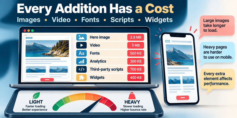
The decision to add them may happen long before a developer is asked to make the website faster.
Google's Core Web Vitals focus on three aspects of real-world experience: loading performance through Largest Contentful Paint (LCP), responsiveness through Interaction to Next Paint (INP), and visual stability through Cumulative Layout Shift (CLS). The recommended “good” thresholds are LCP within 2.5 seconds, INP at 200 milliseconds or less, and CLS at 0.1 or less, evaluated at the 75th percentile.
Those numbers are useful for measurement, but the broader point is less technical.
Every element added to a page has a reason for being there and a cost.
Sometimes the cost is worth it.
Sometimes the 8 MB background video exists mainly because everyone became accustomed to seeing it during the design process.
Mistake 13: Treating Accessibility as an Optional Final Check
Accessibility can suffer from the same “we'll add it later” thinking as SEO.
By the end of a project, however, some accessibility problems are already embedded in the design system: weak contrast, unclear focus states, poor heading structure, inaccessible controls or interactions that assume everyone uses a mouse.
The Web Content Accessibility Guidelines are developed by the W3C as an international standard for making web content more accessible to people with disabilities. WCAG 2.2 covers websites and web applications across desktop and mobile environments, with criteria organised around content being perceivable, operable, understandable and robust.
WCAG 2.2 also added criteria covering areas such as keyboard focus, target size and accessible authentication.
Not every business owner needs to become an accessibility specialist.
But thinking about readable contrast, keyboard navigation, labels, alternative text, understandable forms and usable touch targets while the site is being designed is very different from trying to repair everything afterwards.
Accessibility is another example of a supposedly “technical” subject that begins with ordinary design decisions.
Mistake 14: Forgetting What Happens After Someone Clicks Send
Contact forms are tiny pieces of interface.
A few fields and a button.
Behind them can sit considerably more machinery.
When I worked on the Cordinant contact form, the visible form remained simple. Behind it, however, I had to think about server-side validation, CSRF protection, spam behaviour, rate limiting, header injection and authenticated email delivery.
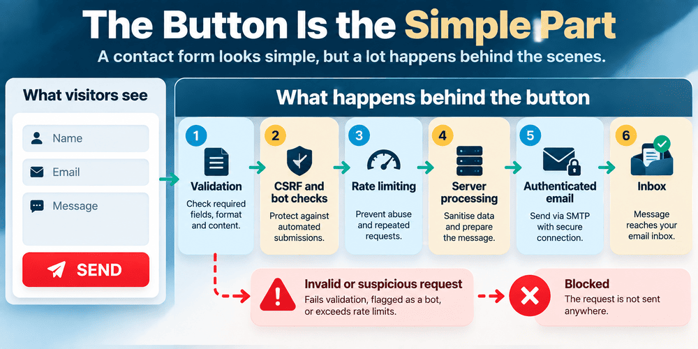
That is a good example of how a website can appear much simpler from the outside than it really is.
Forms also need a human journey.
Where does the message go? What happens if delivery fails? Is the visitor shown a useful confirmation? Does anyone actually monitor the destination mailbox?
The same question applies to newsletter forms, quote requests, bookings and checkout flows.
A successful button click is not necessarily a successful business process.
Mistake 15: Leaving Security, Backups and Maintenance for “Later”
A static-looking website is still software running somewhere.
It has hosting. Files. Configuration. Domain settings. Possibly a database, CMS, plugins, forms, accounts or an administrative interface.
Those pieces change the risk considerably.
OWASP's security guidance makes an interesting point about backups: protecting the live application is not enough if poorly protected backups expose the same code, data or credentials. Its testing guidance also warns that forgotten backup files and old copies left on web servers can reveal sensitive information.
This is one reason “we have backups” is only the beginning of the conversation.
Where are they stored?
Can they actually be restored?
Can the public web server expose them?
Who has access?
A similar problem exists with software maintenance. A website built on a CMS, framework or third-party packages does not freeze in time on launch day.
A backup is useful only if it can be recovered safely. Keeping forgotten archives, database exports or configuration copies inside publicly accessible web directories can create a security problem rather than solve one.
Mistake 16: Installing Analytics Without Deciding What Matters
There is a comforting feeling in seeing a dashboard full of numbers.
Visitors. Sessions. Views. Engagement. Traffic sources.
But measurement is useful only when the numbers connect to questions.
For one website, an important event might be a completed enquiry. For another it could be viewing product documentation, starting checkout, downloading something or reaching a particular page.
A website can have more traffic while becoming less useful to the business.
The opposite is also possible.
This is why deciding what to measure after launch can be surprisingly difficult. If nobody defined what meaningful activity looks like, the analytics system can produce plenty of information without providing much direction.
There is also a practical reason to think about this before launch: you cannot go back in time and collect data that was never measured.
Mistake 17: Buying Hosting for the Website You Have Today
Hosting is one of those decisions that can be either overcomplicated or barely considered.
Some small websites do perfectly well on ordinary shared hosting.
Others eventually need different resources because they are running heavier applications, receiving more traffic, processing background tasks or serving large amounts of media.
Buying infrastructure for imaginary future scale can waste money.
Ignoring future requirements entirely can create migration work later.
The sensible point is somewhere between the two.
The same applies to domains, email and external services. It helps to know who owns the domain, where DNS is controlled, where the site is hosted, where business email lives and who has access to each account.
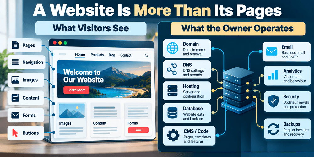
These details are boring until something goes wrong.
Then they become extremely interesting.
Mistake 18: Launching Without Testing the Boring Things
People naturally inspect the exciting parts of a new website.
The homepage animation.
The hero.
The new logo.
The product cards.
The boring things deserve attention too.
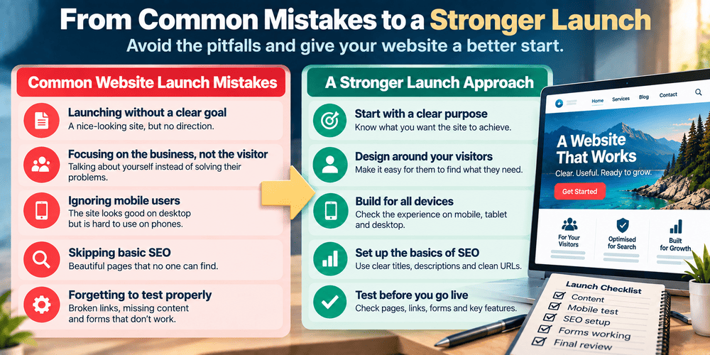
- Test navigation on desktop and mobile.
- Open important pages directly rather than always entering through the homepage.
- Submit every public form.
- Check validation and error states, not only successful submissions.
- Test important links and redirects.
- Check page titles and descriptions.
- Review canonical URLs where relevant.
- Check robots and sitemap configuration.
- Test images for sensible dimensions, loading and alternative text.
- Review keyboard navigation and visible focus states.
- Check important pages at different screen widths.
- Confirm analytics or other required measurement is actually recording.
- Make sure backups exist and understand how restoration would work.
- Check that administrative pages and sensitive files are not publicly exposed.
This is not an exhaustive website launch checklist. Different websites need very different testing.
An online shop has concerns that a portfolio does not. A membership application has authentication issues that a static company website does not.
The checklist becomes useful when it reflects the actual website rather than an imaginary universal one.
The Most Expensive Mistake May Be Trying to Get Everything Right
There is an uncomfortable contradiction in all of this.
Planning matters.
Architecture matters.
SEO, accessibility, content, performance and security matter.
But trying to solve every possible future problem before launching can become its own failure mode.
You can spend months designing a perfect structure for traffic that does not exist yet, features nobody has requested and content that may never be written.
I do not think the answer is to plan everything.
It is to distinguish between decisions that are easy to change and decisions that become painful once the website grows.
| Easier to Change Later | Usually More Disruptive to Change Later |
|---|---|
| Button wording | URL structure across a large site |
| Individual images | Underlying content model |
| Paragraph copy | CMS or commerce architecture |
| Minor spacing | Navigation across hundreds of pages |
| One page's metadata | Domain or large-scale migration |
Even this distinction is not absolute.
Sometimes changing technology is surprisingly straightforward. Sometimes changing one apparently innocent sentence affects ten pages because it was hard-coded everywhere.
That uncertainty is part of building websites.
A Website Is Easier to Understand Once People Start Using It
I have changed Cordinant many times.
Some changes were visual. Others involved product structure, blog categories, URLs, documentation, SEO, contact handling or the CMS behind the public pages.
If I were rebuilding the site from zero, I would make some decisions differently.
That does not necessarily mean the original decisions were foolish.
The website itself changed.
The products changed.
I understood more clearly what I wanted to publish.
New requirements appeared because the site was being used rather than imagined.
This is why I am increasingly sceptical of the idea of a website being “finished.”
Launch matters. It creates a useful boundary between building privately and operating publicly. But it does not freeze the website in its ideal form.
Once a site is live, it starts producing information that mock-ups cannot provide.
You discover which pages need more explanation. Which navigation labels are confusing. Which content deserves its own section. Which technical shortcuts have become annoying. Which features sounded important but are barely used.
Some of the best website decisions may therefore happen after launch.
The mistake is not discovering that the first version was imperfect.
The mistake is assuming that the first version was supposed to be the last one.