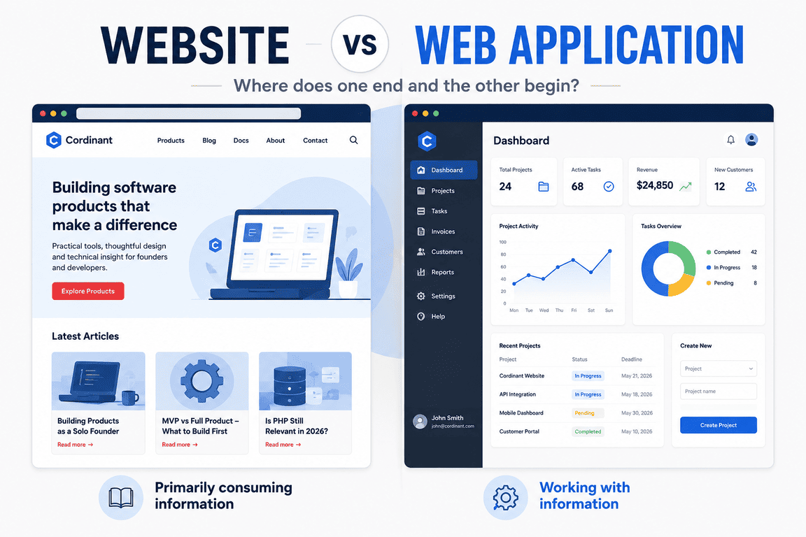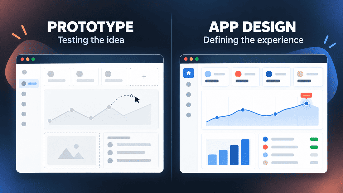
Imagine two application dashboards displayed next to each other. Both have a sidebar, several charts, a few summary cards and a table of recent activity. They may look almost identical, yet one could be a prototype created to demonstrate an idea, while the other could be part of a complete app design.
The difference is difficult to see in a screenshot. It becomes clearer when someone clicks a button, enters unexpected data, opens the application on a phone or tries to understand what happens after an error. A screen can look finished long before the product behind it has been properly considered.
I encounter this distinction while creating my own digital products. Because I work without a separate product, design and development team, prototyping, app design and implementation often happen close together. A rough screen can become functional quickly, while a working feature may send me back to reconsider the interface.
This makes the question more complicated than a simple comparison between an unfinished prototype and a polished design.
A Prototype Is Built to Answer a Question
An app prototype is usually created to explore an idea or reduce a particular uncertainty. It does not need to describe the entire product. It only needs to reveal something that was previously unclear.
That uncertainty might concern the concept itself. Does the proposed product make sense when it is represented as a real interface? Can someone understand the main workflow? Is the navigation logical? Will the planned technical approach work?
Different questions require different types of prototypes. A sketch may be enough to examine the position of information on a screen. A clickable mockup can help test navigation between pages. A coded prototype may be needed when the uncertain part involves data, offline behaviour, performance or integration with another system.
A prototype is defined less by how it looks than by the question it was created to answer.
This is why a prototype does not have to be crude. It can be visually polished and still remain an experiment. Equally, it may look very basic while solving the most important technical question in the project.
App Design Is More Than the Appearance of Screens
App design is often understood as the visual stage of product creation: choosing colours, typography, icons and button styles. Those elements matter, but they represent only the visible part of the work.
Designing an application also means deciding how its parts relate to one another. It includes the information structure, navigation, user flows, interaction patterns and the way the interface responds to different conditions. It considers what users see before, during and after an action.
A designed transaction form, for example, is not only a set of attractive fields. Someone must decide which information is required, how errors are explained, what happens after submission, whether an entry can be edited later and how the form behaves on a narrow screen.
Many of these decisions remain invisible in a static mockup. They only become noticeable when the product is used.
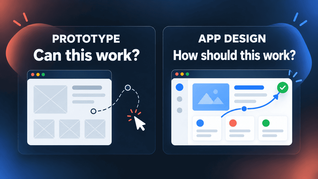
A prototype asks whether an idea could work. App design tries to define how the product should work for the people using it.
The two activities naturally overlap. A prototype can test a design decision, and design work can reveal what needs to be prototyped. The distinction is useful, but it is not a wall separating two completely independent processes.
Two Similar Interfaces Can Have Very Different Depth
A prototype may represent only the most direct route through an application. The user opens a page, completes an action and reaches the expected result. This is often enough when the purpose is to explain the idea or test the basic flow.
A complete product has to deal with less convenient situations. An account may contain no data. A name may be much longer than the placeholder used in the mockup. A request may fail. Someone may press the same button twice, enter a negative number or leave halfway through a process.
App design has to consider at least some of these possibilities. It does not mean that every theoretical case must be solved before development begins, but the design has to extend beyond the ideal demonstration.
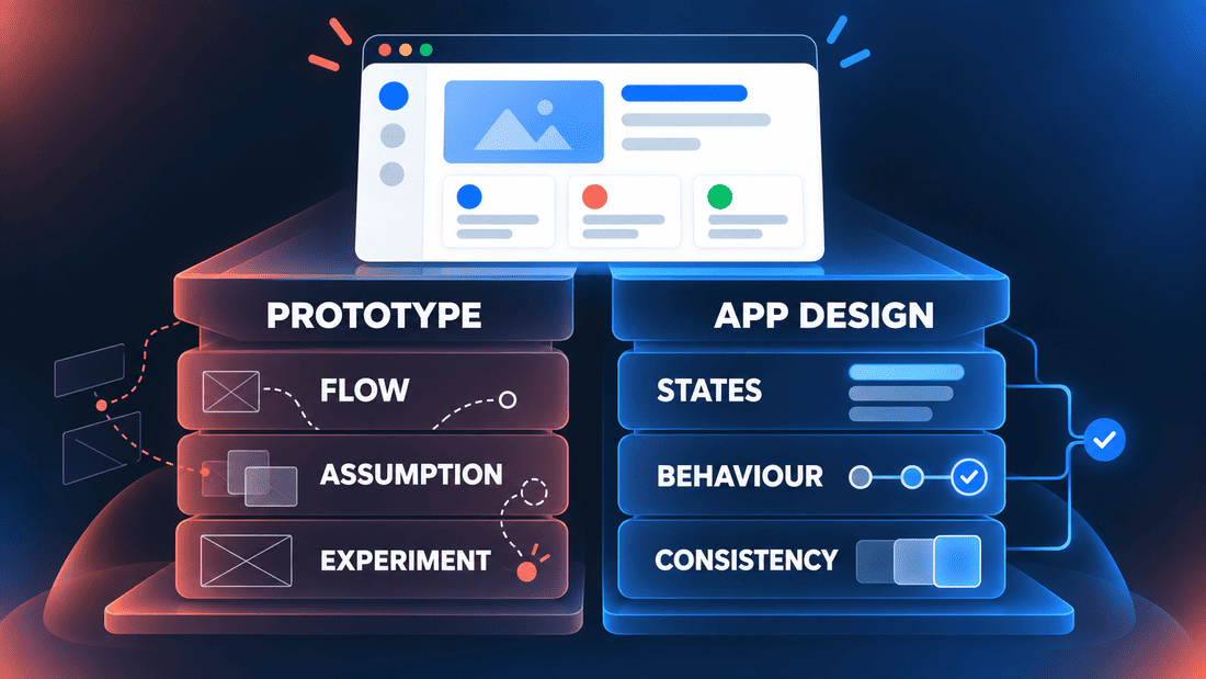
| App prototype | App design |
|---|---|
| Tests an idea, assumption or workflow | Defines the intended product experience |
| May cover one limited part of the application | Considers how different parts connect |
| Can ignore secondary states | Accounts for empty, error and loading states |
| May be disposable | Creates patterns that should remain consistent |
| Can use simulated or placeholder data | Must accommodate realistic content and behaviour |
These are tendencies rather than strict rules. A prototype may gradually become part of the final product, especially when it is built with real code. A design may also remain deliberately incomplete while a difficult technical question is investigated.
My Budget: The Dashboard Is Only the Visible Result
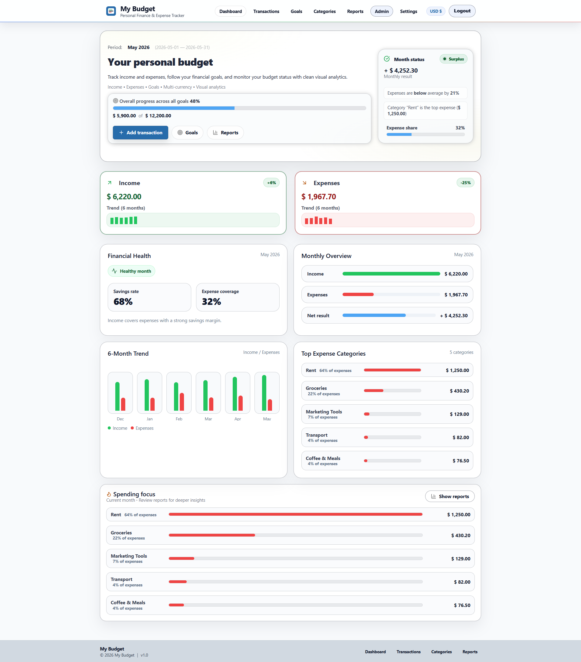
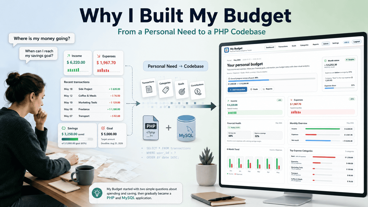
My Budget provides a useful example because its main dashboard can communicate the product very quickly. Income, expenses, recent transactions and charts make the purpose of the application visible without a long explanation.
A prototype of that dashboard could be convincing even if the figures were static. It could show the intended layout, establish the visual direction and help someone understand the basic concept. For those purposes, it might do its job well.
The actual product extends far beyond that first impression. Transactions have to be created, edited, deleted and assigned to categories. Goals need contributions. Reports depend on dates, transaction types and stored records. CSV exports must contain useful data rather than whatever happens to be convenient for the interface.
Once these relationships exist, they begin to influence the design. The dashboard is no longer a free arrangement of attractive cards. It is a view produced by the wider application.
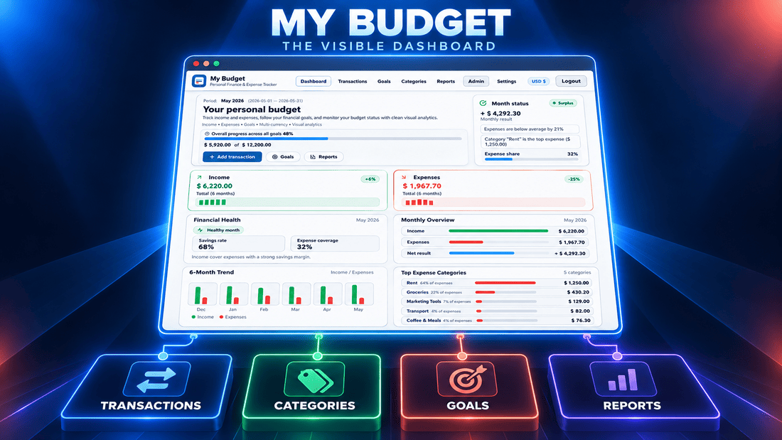
Empty states are a simple example. A prototype dashboard may start with six months of carefully prepared sample data. A new user starts with nothing. The design has to explain that empty account without making the application look broken or meaningless.
The same issue appears when there are many transactions, unusually long category names or goals with no contributions. These are not necessarily problems that a first prototype should solve. They are signs that a demonstrated idea is becoming a designed product.
Some Products Cannot Be Explained Properly With Screenshots
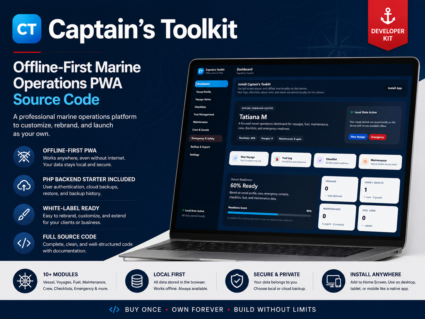
Captain’s Toolkit presents a different kind of problem. It includes areas such as voyages, fuel, maintenance, crew information, emergency details and checklists. A collection of static screens can show where these sections are located and how they may look.
However, it is also an offline-first application. The behaviour of an offline product cannot be fully communicated by a screenshot. What matters is not only the appearance of a form but whether information remains available when the connection is unreliable and whether the surrounding experience still feels understandable.
In this situation, a functional prototype can reveal more than a detailed visual design. It may be narrow and visually unfinished, but it can test the part of the product carrying the greatest uncertainty.
This is one reason I find the phrase “high-fidelity prototype” slightly misleading when it is used only to describe visual polish. Fidelity depends on what the prototype is supposed to represent. A beautifully linked mockup may have high visual fidelity but almost no technical fidelity. A plain coded experiment may be the opposite.
For a Solo Creator, the Stages Refuse to Stay Separate
In a larger organisation, app prototyping, UI and UX design, software architecture and development may be assigned to different people. The work still overlaps, but the deliverables make the boundaries easier to see.
Solo product creation feels different. I may think about a screen and immediately notice that it requires a new database relationship. After building that relationship, I may discover that the original screen asks users for the wrong information. Changing the workflow then affects the navigation, documentation and sometimes the product description.
The process becomes a loop rather than a sequence. An idea produces an interface. The interface exposes a technical question. The implementation reveals a usability problem. The revised design changes part of the implementation.
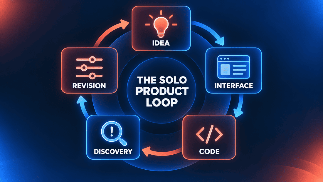
This can look inefficient from the outside, but some amount of movement between these areas is difficult to avoid. A digital product is not created as a series of isolated documents. Each part places limits on the others.
The challenge is recognising when a quick experiment is still an experiment. A temporary navigation structure or improvised database field can quietly become permanent simply because the application already appears to work.
AI Can Make a Prototype Look Finished Very Quickly
AI-assisted development has made the boundary even less obvious. It can help generate a component, suggest a layout, build a form or produce a working version of a small feature much faster than creating each part manually.
This is useful for exploration. I can examine an idea in a more concrete form without investing the same amount of time that a coded experiment previously required. It becomes easier to compare approaches or discard one that does not feel right.
The speed can also create a false impression of progress. A generated dashboard may contain polished cards, icons and charts, but it does not necessarily understand the product’s data structure. A generated form may handle the obvious input while missing validation, unusual states or consistency with the rest of the application.
AI also tends to provide an answer even when the product decision itself is still uncertain. The result can be technically plausible and visually acceptable without being appropriate for this particular application. Correcting those assumptions sometimes takes longer than generating the first version.
I still find AI valuable during both prototyping and development. I simply do not treat the presence of a working interface as proof that the app has been designed.
The speed at which an interface appears has little connection to the amount of product thinking still required behind it.
The Polished Prototype Trap
A rough prototype usually announces its limitations. Placeholder text, unfinished styling and incomplete controls make it obvious that people are looking at an experiment.
A polished prototype does the opposite. It can create confidence before the difficult questions have been answered. Clients, collaborators and even the person building it may begin to think that only development remains.
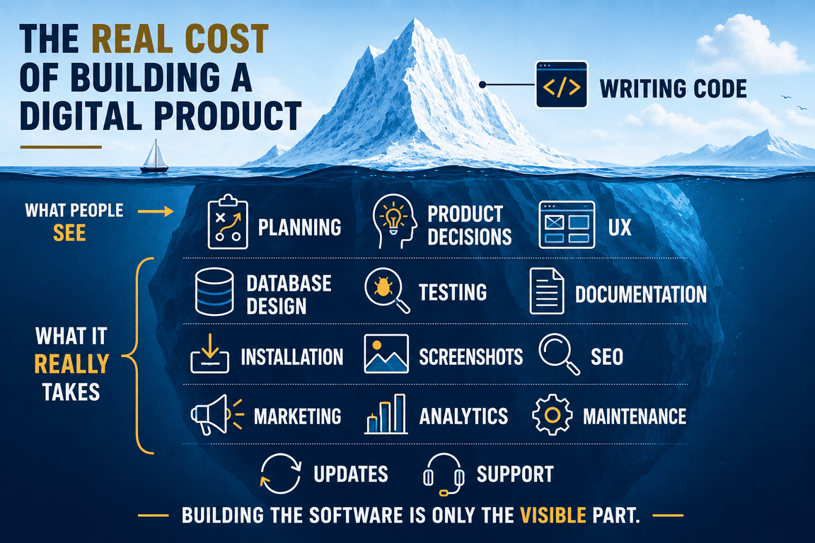
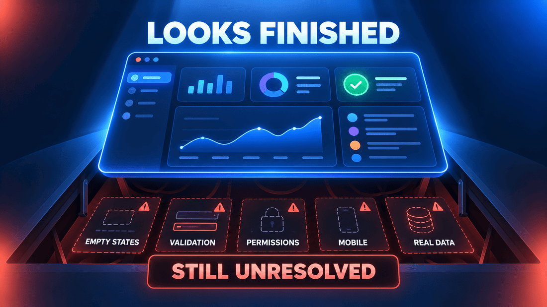
The missing work is rarely visible in the main demonstration. It exists in permissions, validation, responsive behaviour, empty accounts, large datasets, failed actions and the connections between features. It may also exist outside the interface in installation, security, documentation and maintenance.
This does not make polished prototypes a bad idea. They can be effective for presenting a concept, testing visual direction or discussing a product with people who find wireframes too abstract. The risk comes from confusing visual completeness with product completeness.
A Working Prototype Has Its Own Trap
Coded prototypes appear more substantial because they actually do something. Data can be saved, buttons perform actions and the application may already be running on a server. It becomes tempting to continue building directly on top of them.
Sometimes this is a reasonable approach. Throwing away working code purely because it was called a prototype would not automatically improve the product. The decision depends on how that code was structured and what shortcuts were taken.
The difficulty is that prototype shortcuts are easy to forget. A simplified permission model, duplicated component or temporary naming convention may survive long after the experiment has answered its original question. Once more features depend on it, revision becomes harder.
A working prototype therefore needs a moment of reconsideration. Which parts represent real product decisions, and which parts were created only to make the test possible? I do not think there is always a clean answer, especially in a solo project, but asking the question can expose assumptions that have started to look permanent.
A Source-Code Product Has Two Audiences
The applications I create are not only intended to be used. They are sold as self-hosted source-code products that buyers may install, study, customise or use as a foundation for something else.
This adds another layer to app design. The end user needs an interface that is clear and consistent. The buyer also inherits the project structure, configuration, installation process and relationships between features.
A prototype may prove that the central idea works for the end user without proving that the codebase is suitable for another developer. Conversely, a technically organised foundation does not guarantee that the visible product is comfortable to use.
This is one of the reasons the path from a working application to a source-code product takes longer than it first appears. Documentation, demo behaviour, settings, installation and predictable structure are not usually the most exciting parts of a prototype. They become important when the product has to leave the environment in which it was created.
What Should Come First?
There is a familiar expectation that product creation should begin with research, continue through wireframes and prototypes, move into detailed design and finish with development. That order can be helpful, particularly when several people need to coordinate their work.
It is not the only possible order. If the largest uncertainty is technical, spending weeks polishing every screen before testing the underlying approach may not make sense. If the concept itself is unclear, a small clickable prototype may be more useful than a database schema. If the product already works but feels inconsistent, the most valuable work may be design rather than another prototype.
I prefer to think about the uncertainty rather than the official stage of the project.
- An unclear concept may need a visual prototype.
- An uncertain workflow may need an interactive prototype.
- A technical risk may need a narrow coded prototype.
- An inconsistent product may need deeper app design.
- A source-code product may need attention to both user experience and developer experience.
These options are not mutually exclusive. The same product may need several of them at different moments. It may even return to prototyping after development has exposed a problem that was not visible earlier.
When Does the Prototype Become the Product?
I am not certain that there is one exact moment. A prototype may gradually acquire real data, validation and responsive behaviour until very little separates it from the application. Another prototype may remain visually impressive but never move beyond simulated screens.
Perhaps the more useful change happens in the way the project is judged. During prototyping, the question is whether the experiment has revealed enough to continue. During product design, the question becomes whether the different decisions form a coherent experience. During development, those decisions have to survive contact with real data, technical constraints and unexpected behaviour.
For a solo creator, all three questions may appear on the same day.
This is why I no longer see an attractive screen as evidence that an application is nearly finished. It may represent substantial work, or it may be the first visible layer of a much larger problem. A rough coded page may sometimes tell me more about the future product than a complete collection of polished mockups.
Two dashboards can still look almost identical. The meaningful difference is hidden beneath them: what has been tested, what has been designed, what remains assumed and which difficult question the creator has not yet asked.